Thinking Outside the <table> at Litmus Live 2016
Last week, I had the honor to speak at The Email Design Conference in London (aka TEDC16 or #LitmusLive). I gave a talk I called “Thinking Outside the <table>”. It’s a mix of some of my previous articles, like Super Mail Forward, Using Flexbox in an Email or The Fab Four Technique, but with a new narration and some new content.
Here are my raw slides. And here is a transcript of my talk.
I am a web developer as well as an email developer. The question I get asked the most when I tell that to web developers is “How is your mental health?”. Because they’re thinking about the disgust they have for using tables for layout, inline styles and other email quirks. But I always thought there’s much more to do if we get past these first feelings.
Today, I want to show you three examples of things I’ve done in the past year or so that illustrate what happens when you start thinking outside the <table>.

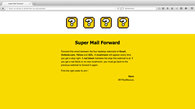
My first example is an email I made called Super Mail Forward. Last year, Litmus held a community contest which theme was Emails Worth Forwarding. The goal was to “take advantage of some of the quirks that happen when an email is forwarded”. I thought this was a very interesting subject, especially since I knew nothing about it.

So first I needed to find out what happens when you forward an email (especially from a webmail). And I really wanted to work with webmails because it is much more easier to just fire up a web inspector and see how styles and markup is transformed by a webmail than from most native email clients. So: what happens when you forward an email?
Turns out, not much more than when the webmail receives it in the first place. This means that if a webmail doesn’t support background images in CSS, like Outlook.com, it will strip out the backgroundproperty when it receives the email, and forward the email without it after that.
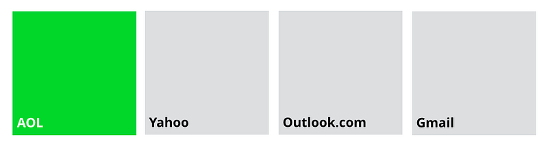
So with that in mind, I kept wondering… How many times can you forward an email before its code becomes complete gibberish? This gave me the idea of some sort of game where you could forward an email between the four webmails of AOL, Yahoo, Outlook.com and Gmail. Each time you forward it to the correct webmail in the right order, the webmail’s cell will turn green, and stay that way until the end. I built a prototype that did exactly that.
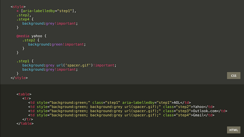
Some of this code is there to turn the cells green. And some of it is there to maintain other cells grey in certain conditions.
When you send the email for the first time to AOL, the webmail will wrap the HTML with a <div class=”aolReplacedBody”> and prefix every CSS rule with the same .aolReplacedBody class. The first cell is activated with an inline style.
In order to maintain this cell grey when viewed in another webmail, I relied on a parsing bug from AOL. When AOL encountered a background image declaration within a <style>, it would incorrectly replace the URL of this image with HTML. This didn’t make any sense, and thus this style would get ignored only on AOL, and maintained that way from now on when forwarded to other webmails.
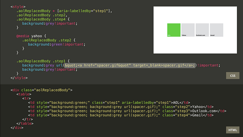
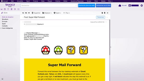
When you forward the email from AOL to Yahoo, Yahoo will once again prefix every class name with its own prefix (like yiv113) as well as with an identifier of its own (like yui_123456789).
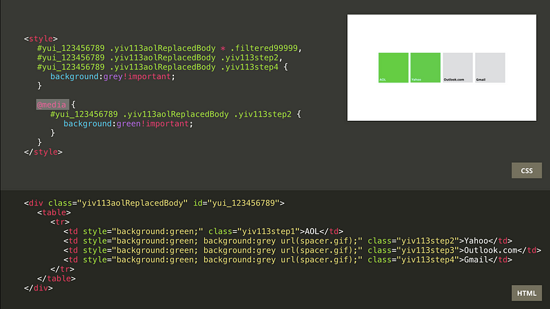
In order to activate the green cell for Yahoo, I used the @media yahoo hack (originally found by Mark Robbins). Last year, Yahoo added support for media queries, but only for a small subset (like min-width or max-width). Yahoo will remove any keyword it does not recognize or support after a @media declaration. So @media yahoo will be transformed to @media, thus activating the styles contained in this media query from now on.
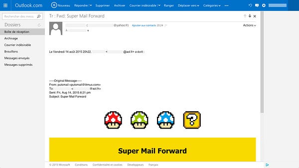
Next, when you forward the email from Yahoo to Outlook.com, Outlook.com will once again prefix every class and id attributes with its own prefix (ecx), and prefix every CSS rule with .ExternalClass. (NB : I’m referring here to the old version of Outlook.com, still available in France.)
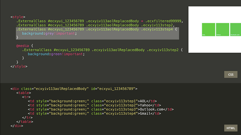
Outlook.com doesn’t support background images declaration in CSS. So it will remove all the inline styles that kept the cells grey with a spacer image. This is great, because it now turns the third cell green for Outlook.com. But it also turns the last one green, normally to dedicated to the final step. In order to prevent this, I set up a rule to maintain this fourth cell grey at this point.
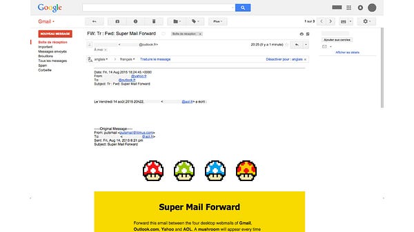
Finally, when forwarding the email from Outlook.com to Gmail, Gmail will remove every id or class attributes. This makes all of the styles in the <head> useless. And thus the four cells are activated in green.
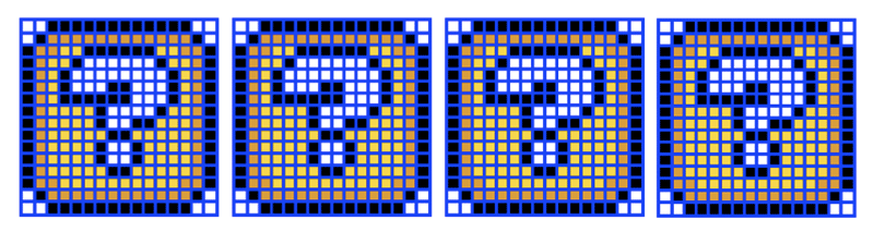
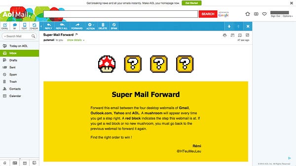
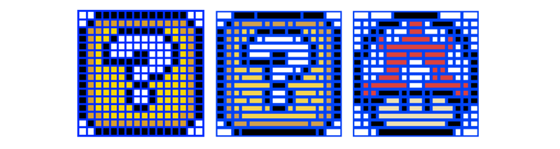
And that’s how I made a first prototype. And then I thought: if I’m able to play with one cell color, why not spice things up a bit and play with a more complex grid. Like, say, 256 cells. This is enough to make great pixel art. And since I’m a huge Mario fan, I decided to use the question blocks from Super Mario World.
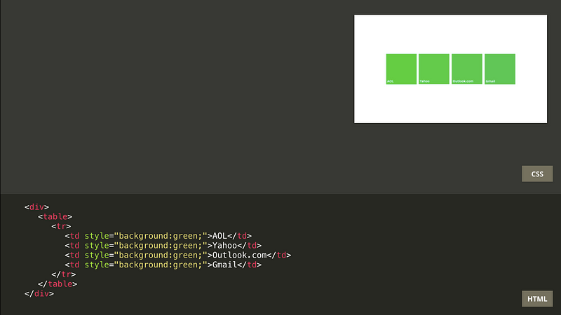
Here’s what the final email looks like. (And here’s the code.)
And here are screenshots from its transformation as you forward it between webmails.
When I coded this final version, I quickly hit the 100 Kb limits where webmails start to block the rest of the email. So I had to spend a lot of time optimizing the pixel grid to have as few cells as possible, by merging cells that had a similar pattern between the question block and the mushroom.
A few days after I submitted this email for the Litmus Community Contest, I was very happy to learn that I won. Except that, well, I was the only participant. I guess sometimes you feel lonely when you’re an email developer.
But the real good news is that AOL fixed their background parsing bug. Last year, I opened a repository on Github called Email Bugs to list some of the issues and bugs I encounter. So I created a detailed report of this bug. And it was reported on Twitter to people working at AOL. And a few weeks later it was fixed. Turns out, AOL is actually very receptive about bugs in their webmails, and I’ve been able to report and help fix other bugs since then.
Most of the bugs I find are harmless. But sometimes, I find things much more serious and important. Which leads me to the second part of my talk about webmail security.

Webmail security is very important. Think of all the personal data you have in your emails. Messages from your family and friends, with personal photos. Messages from your bank. Messages from every website you’ve ever signed up.
Next to that, some HTML and CSS can actually be pretty dangerous within an email. For example, position:fixed in CSS allows to position an element above everything else, even a webmail’s own interface. The following example could place a link to a malicious website above everything else.
<a style="position:fixed; left:0; right:0; top:0; bottom:0;" href="http://example.com">…</a>So some HTML and some CSS have to be filtered within webmails. But sometimes it’s hard to wrap your head around why and how it’s done.
Last year, I noticed that one of the most popular french webmail filtered the property overflow in CSS. But the way it did this was that it replaced the word overflow by java-script. So the following code…
<div style="overflow:hidden;">…</div>…would be transformed into:
<div style="java-script:hidden;">…</div>But not only did they do this within a style attribute in HTML, but they also did that in the email text itself. Which means that if you received an email from Stack Overflow, it would actually read Stack java-script. And they also did that for URL as well. Which means that any link inside the email viewed from that webmail redirects to stackjava-script.com.
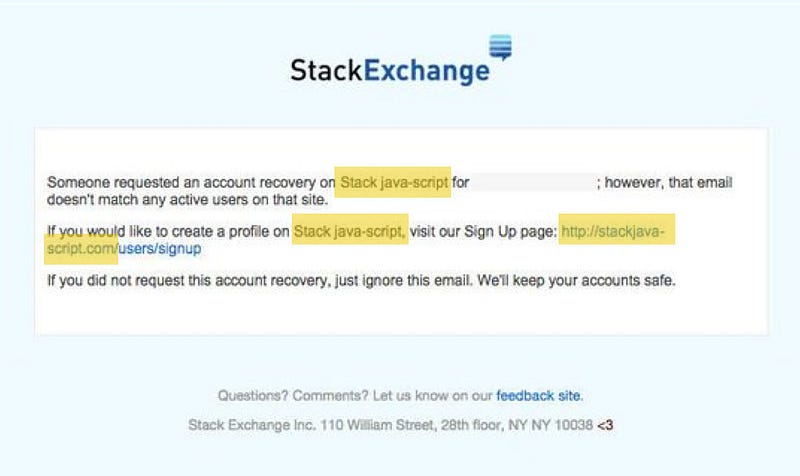
An attacker could buy this domain, create a phishing page that looks like Stack Overflow, and get users’ credentials. This is very bad for users security.
But above it all, I was haunted by this question: why java-script? Why would a webmail replace the name of the overflow property in CSS with a java-script keyword.
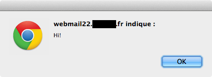
After looking at lists of keywords in JavaScript, I discovered that overflow is actually an event in JavaScript, specific to Mozilla. So I took that list of events in JavaScript, and tested each and every one of them to see what other keywords would be replaced. Fortunately, the most common events attributes in HTML like onload, onmouseover or onclick were filtered by this webmail. But out of the 301 events I tested, only 126 were filtered.
Among these unfiltered events was onanimationend. It is an event triggered when a CSS animation ends on an element. I thought it should be possible to use this to use JavaScript without any user action required. So I built the following email to trigger a JavaScript alert.
<style>
    @keyframes bar {}
    .foo { animation:bar; }
</style>
<div class="foo" onanimationend="alert('Hi!');"></div>
And it worked.
I was in shock. Because once you let any JavaScript pass, you can do pretty much anything. I was able to load an external script that would read all the emails from a user, send emails on behalf of that user, and even delete emails. I tried this successfully between two of my test accounts.
So of course I reported this bug. But it was hard, because this webmail had no bug report form. I had to ask for help on Twitter, and eventually found someone who knew someone on said company. I ended up having a phone call with members from the security team at this company. I explained all the bugs and exploits that I found. And their reception was pretty much a cold shower. I was told that a webmail was by nature a security issue, that they had to make compromises between security and user experience. I told them I was interested to work with them and help them make their webmail more secure for their users. And that was pretty much it.
All I got was a lousy thank you a few days after this phone call. It took them more than five months to fix this issue.
So webmail security is a big deal. And here’s an interesting thought exercise. How do you filter JavaScript out of an email? You can remove <script> tags, which is a good start. But you also need to remove every HTML event attributes. There are hundreds of those, and some are specific to some browsers. And more are added with each new specification.
The more I think about it, the more I believe the best way to make a webmail secure is to use a whitelist. Only allow HTML tags, attributes and CSS properties that you know are safe.
This is something that Gmail does extremely well. In fact, probably a little too well for us email developers. Gmail allows no class and no id attributes, no <style> tag on mobile, which means no media queries on mobile.
There’s a famous quote (attributed to Phil Karlton) that I love.
There are two hard things in Computer Science: cache invalidation and naming things.
I really wish we’d add a third one.
There are three hard things in Computer Science: cache invalidation, naming things and responsive emails.
It’s hard to code responsive emails because you have to juggle between clients like Outlook 2016, which uses Word’s rendering engine and barely supports anything but tables, and a lot of webmail with very unequal CSS support.
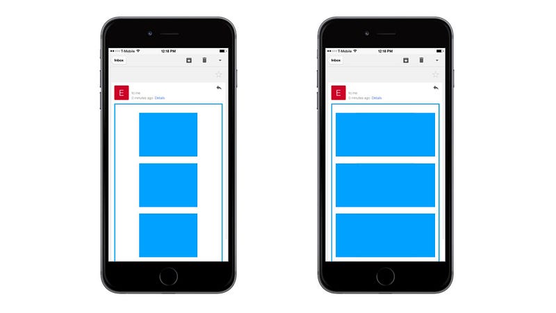
Thankfully, email developers have come to find their ways around this. And some techniques have become quite popular, like fluid/hybrid methods to create responsive emails without media queries. This technique in particular relies to having elements aligned next to each others (using CSS floats or display:inline-block) and going below each others when there’s no longer enough space. But I always had one problem with that: on a big mobile screen on Gmail, you end up with tiny centered columns.
So how can we make a column grow on mobile without media queries?
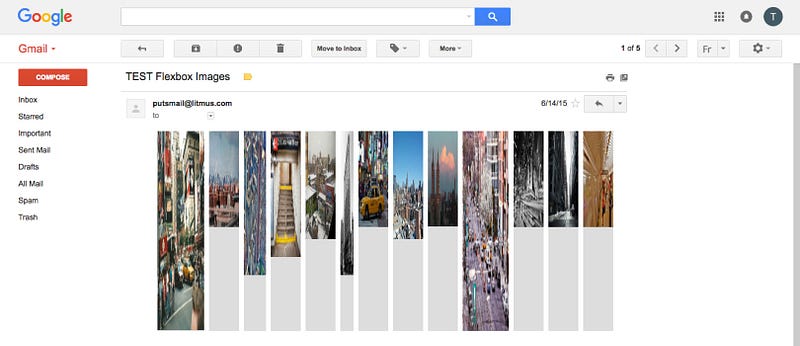
The first answer that may come to your mind if you’ve done any web development in the past few years is… FLEXBOX. Flexbox is an ideal candidate for emails because it allows to build complex grids like the following, that can adapt from desktop sizes to mobile sizes, without a single media query.

The main styles required for such a grid are the following.
.grid {
    display: flex;
    flex-wrap: wrap;
    flex-direction: row;
}
.grid > * {
    flex: 1 1 auto;
}
This works great in a browser. But in a webmail like Gmail, the only style supported is display:flex. This means that the default flexbox values are applied, and the previous grid looks like this.
So flexbox in an email is out of the way. So how can we make a column grow on mobile without media queries and without flexbox?
I found a solution. And there are three ideas that put me on track.
The first one is Gmail CSS support. With a few exceptions, Gmail filters styles based on property names, and not on their values. This means that in the following example, we can’t use the background-size property because Gmail doesn’t support it.
.hero {
    background: url(image.jpg) 0 0;
    background-size: cover;
}
However, we can use a background-size declaration within the shorthand background property, and Gmail won’t filter it.
.hero {
    background: url(image.jpg) 0 0 / cover;
}
This means we can also use things linear-gradient or radial-gradient in CSS.
.hero {
     background:radial-gradient(circle at 30% 107%,
         #fdf497 0%, #fdf497 5%, #fd5949 45%,
         #d6249f 60%, #285aeb 90%);
}
(This was actually done by the great EmailWeekly newsletter as a tribute to the new Instagram logo a few months ago.)
This means Gmail supports the calc() function in CSS. This is pretty interesting because it means we can do layout calculations based on elements width. For example, the following code would create a fluid column taking the full width of a parent element, minus 200px fixed pixels for a sidebar.
.main {
    width: calc(100% — 200px);
}
The second idea that helped me find a solution is this article about responsive typography by Mike Riethmuller. He created the very long following formula mixing font sizes and breakpoints boundaries, viewport units and division and multiplication.
font-size: calc( 12px + (24 - 12) * ( (100vw - 400px) / ( 800 - 400) ));
While this is an amazing example of what’s possible with calc(), this method still requires media queries as a railing guard to prevent font sizes from shrinking too low or growing too big. But still, I thought that was very interesting.
The last idea that helped me find a solution is this quiz by fellow french developer Raphaël Goetter. He asks: “Without cheating, what is the size of an element with the CSS properties below?”
min-width: 480px;
width: 320px;
max-width: 160px;
The answer is… 480px. This is how it’s defined in the CSS 2 specification. Basically it gets down to this:
- If the width value is greater than the max-width value, max-width wins.
- If the min-width value is greater than the width or max-width values,min-width wins.
With all this in mind, I spent countless time looking for a solution, playing with the calc() function, trying things with viewport units in CSS, etc. Until finally… Bingo! I had something!
The technique I found is based on the three properties width, min-width and max-width and the calc() function in CSS.
And I called that… The Fab Four Technique.

There are mainly two reasons I called it like that:
- I found that in January, and The Beatles discography was just released on Spotify. So I listened to The Beatles a lot while working on this.
- There are two hard things in Computer Science: cache invalidation and naming things.
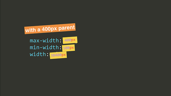
The Fab Four technique allows to build a grid that will go (for example) from four columns above a defined breakpoint to a single column below it. Here is the corresponding code.
max-width: 100%;
min-width: 25%;
width: calc((480px — 100%) * 480);- The
max-widthproperty defines the width of our elements below our breakpoint. With 100%, the column will grow full width. - The
min-widthproperty defines the width of our elements above our breakpoint. With 25%, we’ll get four columns. - The
widthmakes the calculation with the desired breakpoint. Here we define a breakpoint of 480px.
Let’s see what it looks like at two different sizes: one above our breakpoint, and one below it.
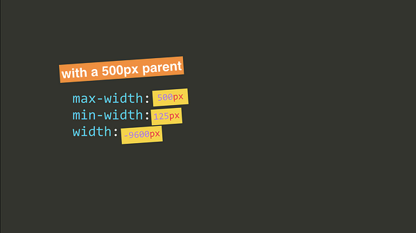
At 500px (above our breakpoint), the calculated width equals -9600px. So the min-width of 125px is applied (thus creating a four columned layout).
At 400px (below our breakpoint), the calculated width equals 38400px. So the max-width of 400px is applied (thus creating a single full width column).
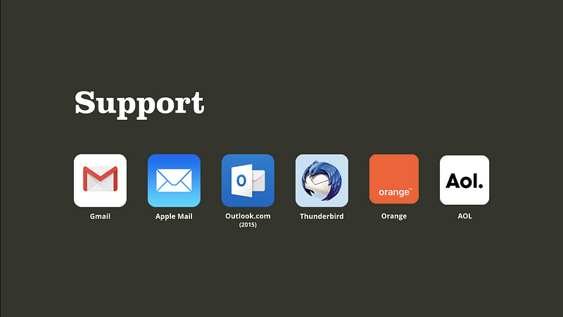
This works well in Gmail (from the desktop webmail, even for Google Apps accounts, to the iOS and Android apps), but also on Apple Mail, the old Outlook.com, Thunderbird, Orange and AOL’s webmail. But there are still a few quirks left to make it work perfectly.
The old version of Outlook.com (still available by default in France) supports calc(). But it will filter every property with a calc() that includes any parenthesis. This means that calc(480px — 100%) is supported, but calc((480px — 100%) * 480) is not. Since the initial formula involves parenthesis, we need to refactor it to avoid parenthesis. So the formula to support the old Outlook.com looks like this.
width:calc(480px * 480 — 100% * 480);
Older versions of Android (before Android 5.0) or iOS (before iOS 7) require -webkit- prefixes in order to work. So our code looks like the following.
max-width: 100%;
min-width: 25%;
width: -webkit-calc(480px * 480 — 100% * 480);
width: calc(480px * 480 — 100% * 480);
For other clients that do not support calc() (like Yahoo), we need to provide a graceful degradation. We can use a fluid/hybrid fallback with the following styles.
display:inline-block;
min-width:120px;
width:25%;
But when combined with the fab four code, we end up with two declarations for the min-width property. In order to prevent the two to collapse, we’ll wrap the fab four property with a calc() as well. Which gives us the following.
display:inline-block;
min-width:120px;
width:25%;
max-width:100%;
min-width:-webkit-calc(25%);
min-width:calc(25%);
width:-webkit-calc(480px * 480 – 100% * 480);
width:calc(480px * 480 – 100% * 480);
The new Outlook.com doesn’t support calc() too, so our gracefully degraded fallback should apply. However, this webmail has a bug where it will empty completely an inline style attribute if there’s a multiplication sign within it. In order to prevent that, we need to make our calculation by hand, which gives the following.
width:calc(230400px - 48000%);The final complete code looks like this.
display:inline-block;
min-width:120px;
width:25%;
max-width:100%;
min-width:-webkit-calc(25%);
min-width:calc(25%);
width:-webkit-calc(230400px - 48000%);
width:calc(230400px - 48000%);
I like this technique because it was in front of our faces since the days of IE9. But apparently no one came up with it, or found this interesting enough to talk about it, even though it’s getting us really close to Element Queries, a modern Holy Grail in CSS.
Perhaps my main takeaway is that constraints drive creativity.

Email developers have a tendency to complain about the lack of great CSS support in webmails. And for sure, there are bugs. But turns out we can actually help fix them. And webmails also have their own security constraints, meaning they can not support everything.
If we keep this in mind when working on emails, we can start thinking outside the box, and these constraints can become a fuel for creativity.